- No Products In The Cart
- start shopping
Studio Tashima's Hampstead residence
Situated in Hampstead, London, this chic and modern abode designed by Studio Tashima offers a serene escape from the city. The space features an elegant use of colour and sophisticated patterns, which creates a calm and stylish retreat.
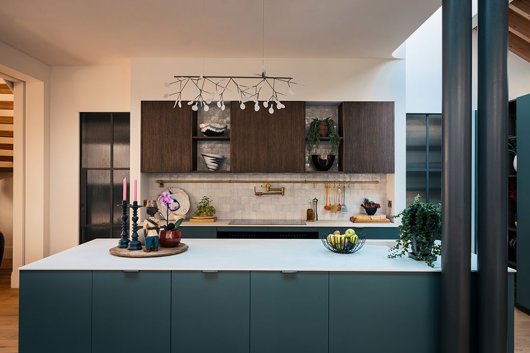
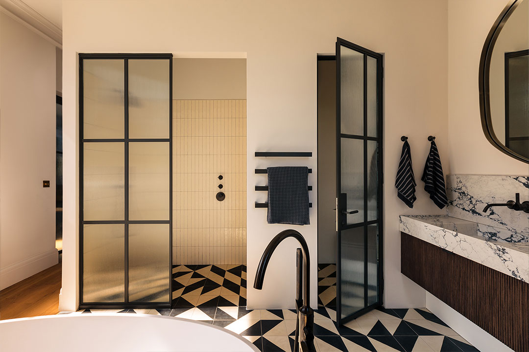
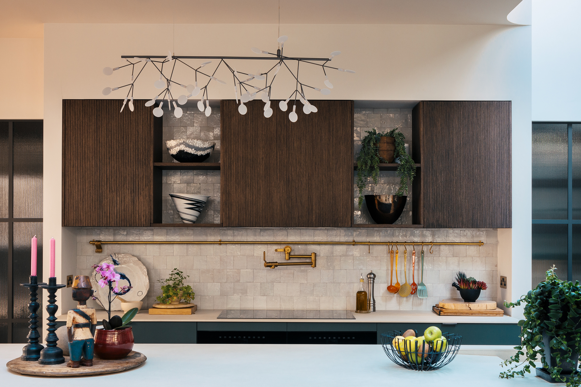
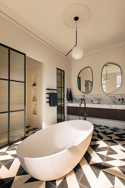
The kitchen balances contemporary design with hints of rustic finishes and natural materials. The splashback is made from our White Zellige tiles, and blends effortlessly between the cabinetry. Whilst the bathroom incorporates a fresh playful take on modern design sensibility, with our Magic Triangle Black handmade encaustic cement tiles setting the stage.
Charles Tashima, the founder of Studio Tashima, shares insights into the design story of this exceptional space.
What was the concept for the design of the kitchen?
Central to our ambition was to get as much light and space into the house as possible, particularly the kitchen which is on the lower ground floor. We were very conscious throughout the project that our South African clients were accustomed to abundant light and open space, particularly horizontal space. We wanted to find as much of this as possible for them here in their new home in London. This was particularly challenging as we didn’t have much to go by with this tall Victorian semi-detached terrace house on an unusual and small triangular site. Despite the size, the house did have the advantage of two gardens – albeit small and like two slivers of a pie.
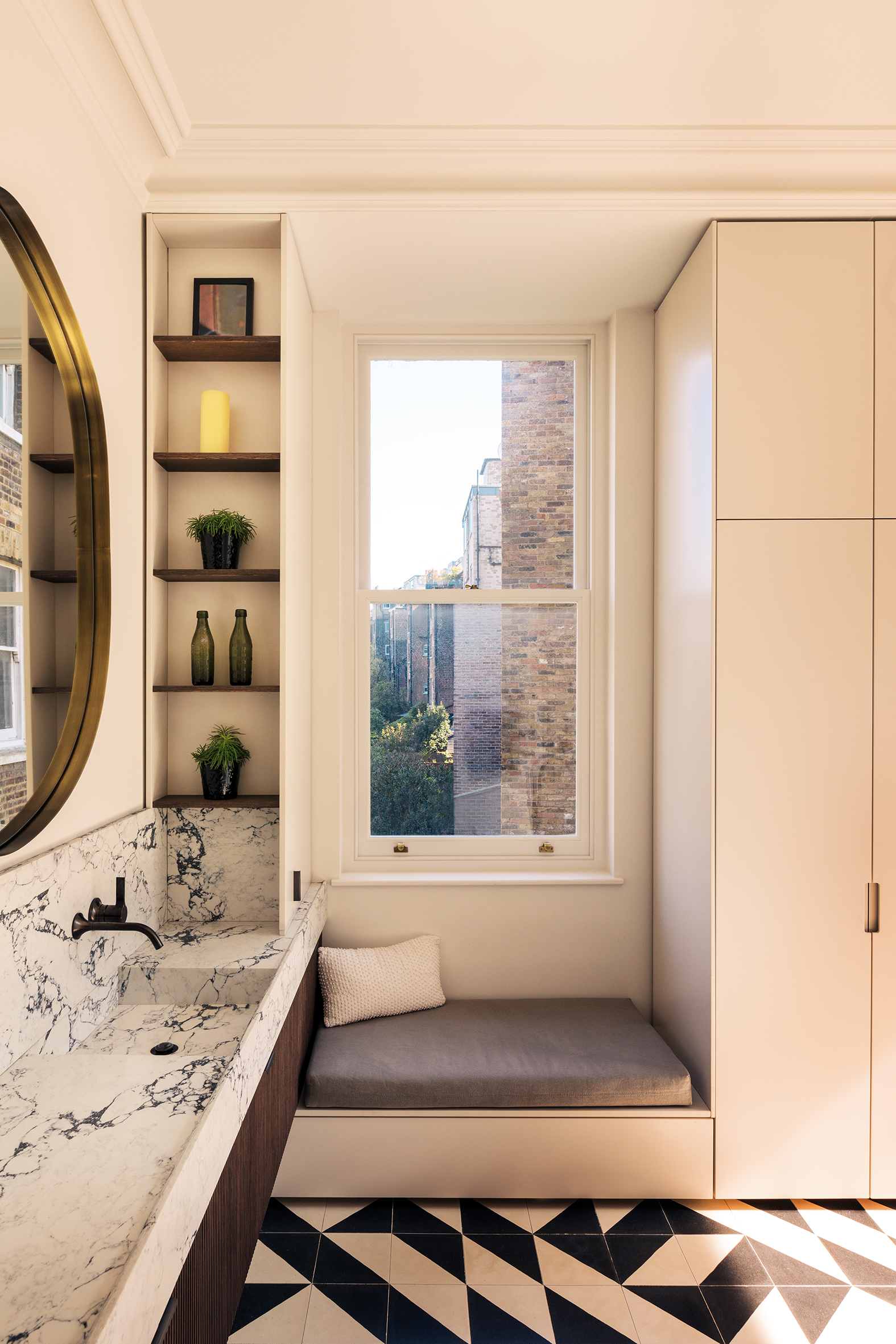
It was also important for us to give the kitchen a sense of material character and richness. This was consciously done through a reduced, contemporary palette. Our client was bringing their furnishings and belongings from South Africa – including paintings, richly coloured furniture, carpets, pieces of artwork. It’s a fantastic and eclectic collection. For this it was important that the surfaces of the house were neutral, but without being flat and empty. We wanted this background to still have a sense of depth and material texture and richness – a natural and organic character. It is for this reason that Zellige tiles suited the project so well. Other materials we worked with included the wide board oak floors set against off-white walls as well as Douglas fir ceiling rafters, steel stair with oak treads. The kitchen designers, Future Classics from South Africa, also kept to this neutral approach contributing a lightly textured green kitchen with off-white countertops.
How were textures and finishes decided for the design scheme?
It was important that the core of the house was neutral, yet with a textural variety and richness. We wanted to provide a setting on which our client’s eclectic furnishings would comfortably sit – organically.
The tiled splashback being visible through the shelves is interesting, could you tell us more about this idea?
We wanted the wall surface to feel as if it were slipping behind the cabinets, up to the ceiling. Following on with this, we wanted the tiles to be read as a part of the plastered walls. As such it was important that the tone of the Zellige tiles was similar to the off-white colour of the walls – a subtle juxtaposition. The light colour places an emphasis on a material and textural shift. It was important that the tiles were not a different colour. In doing so, we wanted to focus on the material qualities of the tile — its pearly gloss, irregular surface and edges and rich variety of white tones. The darkness of the wood shelves enhances the reading through contrast.
Could you tell us about the colour choices?
As mentioned above, it was important to ensure that the colours were neutral. And by having the colour the same as the walls, your eye appreciates more the material qualities of the tile – rather than say a green or red colour. All the colours are natural earthy ones you would readily associate with by being in nature.
What role did the tiles play within the design scheme?
While the extent of tiling is relatively small, the choice of tile was very carefully considered. We had many, many meetings with our clients to ensure we got it right. They seem really pleased with the results.
What was the concept for the bathroom design?
The bathrooms were the only areas where our clients wouldn’t be furnishing with things they’ve brought from South Africa. As such there was a moment where the tiles could play a bit more in a visual centre stage. We wanted to have a bit of fun with the tiling. After showing our client a number of options, they were quickly drawn to these.
Can you tell us more about the monochromatic colour choice?
Outside of the fact that it works with the neutral palette mentioned above. I also believe that it was our client’s interest to have a strong contrasting pattern. In saying this, we did try to push a more subtle shift of greys and black but our clients really liked the boldness.
What role did shape and pattern play in the design?
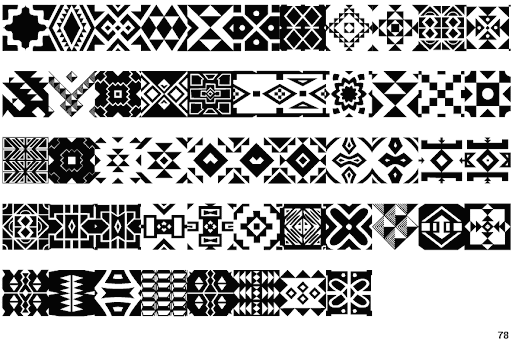
We really love the geometric and graphic quality of the tiles. I’ve not asked them, but the specific geometric design of these specific tiles may well have been influenced by the rich and geometric patterns of Zulu, native people of South Africa. (See below reference). We were pleased with the choice, finding the black and white of it allowed us to really play with the geometry and our interest in tiling and systems, playing with what we refer to as an ‘ordered disorder’. The result is a dynamic and ever-changing visual experience.
Our approach to tile design reveals a long standing pre-occupation of ours. It reflects a broader philosophical interest in systems and how they can be intentionally broken to create something new and intriguing. By playing with an ‘ordered disorder,’ we explore the tensions between predictability and randomness, structure and chaos. It’s also about finding beauty in imperfection and embracing the unpredictability of life.
Breaking the repeating pattern has also had some more practical and compositional reasons. We find the hiding of a strict pattern important when working with existing houses that don’t necessarily have straight walls. The randomised pattern disguises the fact that the walls may not all be straight – something we find in all the old houses we work on. In addition to this, the irregular pattern also treats the total tiled area as a single organic surface – like a painting or a woven carpet. An organic whole.
Can you tell us about the balance of symmetry and asymmetry?
We designed in a combination of being fun and playful – random – together with our eye and the sense of composition. The tiler was amazing as he put in the tiles exactly as we had drawn them. He stuck a large printout of the tile pattern on the wall and checked off each tile as he was laying them. We were pleased to hear the tiler really enjoyed doing the work, even though it took him a bit longer to do than a repeating pattern!
The tiles are laid in a striking pattern, could you tell us about the choice of tile and pattern?
As mentioned above. We love working with tiles and coming up with new patterns. Below is an example of another project of ours.
For this project, we were given a selection of quarry tiles. Our approach here involved establishing a system and then intentionally breaking it to achieve a sense of organic order – resulting in the reading of a whole – a total singular surface rather than a surface with a pattern on it.