- No Products In The Cart
- start shopping
Studio Shan
With a focus on modernist design principles, Studio Shan creates imaginative spaces, filled with beautiful colour pallets, pattern and textures. Director and founder, Lishan Tham, talks us through the design of this residential project by the studio. Photographed by Owen Gale.

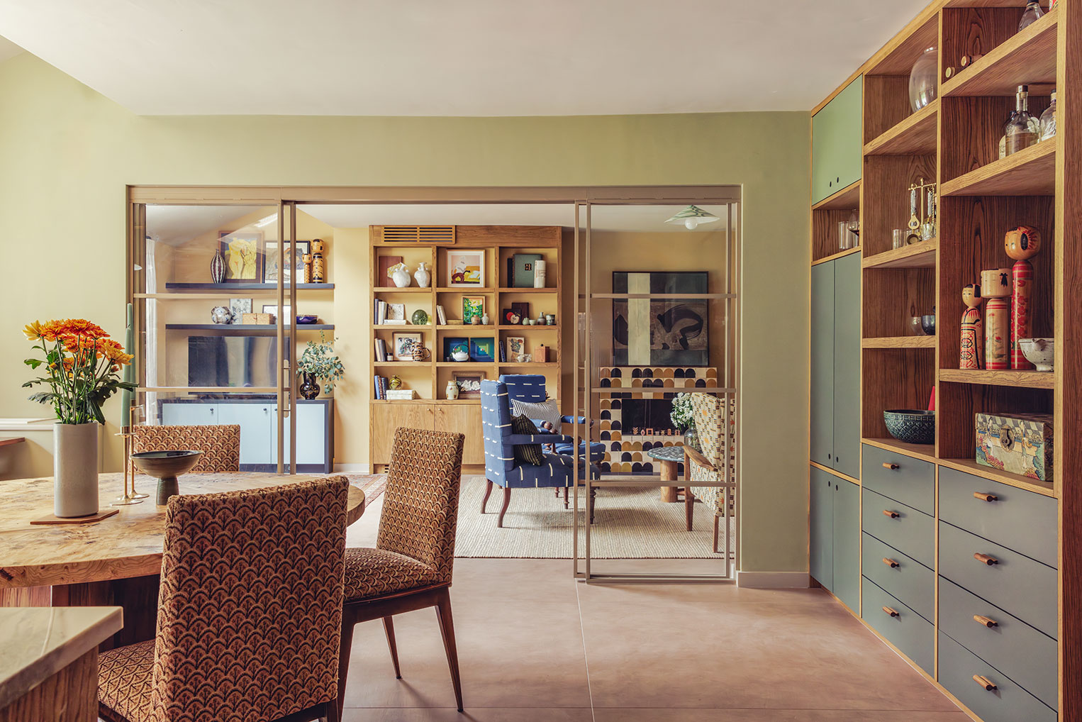
“The brief was to create a warm family home with a focus on colour that was still calming; there was a strong palette influence from a Paul Gauguin painting ‘Landscape with Peacocks’ (image below right) which had plenty of green on greens and warm ochre/yellows.”
“We wanted to create some linear abstraction similar to Japanese screens and Carlo Scarpa’s work (image below left) – with a focus on strong grained timbers; and hand crafted elements to tie the client’s large ceramic collection into the project. There is a clear crafted Asian feel to the project as well.”
In two bathrooms, Studio Shan opted for our tiles, with our Duo Green Stripe encaustic cement tiles covering the floor in the master bathroom and Firenze terrazzo tiles on the walls of an ensuite bathroom.
What inspired your use of colour in the bathroom?
“As per the above overall concept, terracotta tiles were very warm and we wanted to bring them in a more linear/contemporary way through the mosaic format on the walls. To balance this we wanted something light on the floor that still had some accent interest in colour with deep green/blues.”
What is your favourite thing about the Duo Green Stripe tiles in the bathroom?
“The offset linearity (and ability to lay them randomly) was perfect for our concept, working well with the linear terraccotta mosaic on the walls. They feel so warm to the foot, look crafted without being too rustic, which was perfect for our client brief as they love tactile surfaces that aren’t too contemporary. “
In the living room, Studio Shan used our Terracotta Zellige, Amber Arch Terracotta Zellige and Black Arch Terracotta Zellige to surround the fireplace.
Could you tell us more about how you balanced the vintage look with modern design style?
“This is something we really enjoy playing with eg. mixing Edwardian antique armchairs with Pierre Frey’s Koko Indigo linear fabric, which is quite clean yet crafted. The coffee table is a vintage Italian terrazzo piece with chunky legs we had put on that are quite solid and modern in shape; and the sofa has very clean lines despite being a more classic shape. We have fun mixing these elements together that creates a subtly eclectic feel.”
The fireplace is a beautiful focal point, could you tell us more about opting for the Arch Zellige tiles?
“Thank you! We absolutely love the Arch zellige, the client had an existing fireplace which we removed and wanted a contemporary simple shaped surround, but wanted some pattern which these brought in such a retro almost 70s way. They were installed at random as well bringing a more handcrafted feel to the room. “

